The 2004 exhibition of Peter Saville’s graphic design work at Urbis in Manchester inspired me to write my own take on some of his highly influential graphic design for the iconic Factory organisation.
Factory was more than just a record company. For my generation of Mancunians Factory’s unique design styles and range of conceptual ideas not only revolutionised the way music was packaged, but also established the essence of a new and vibrant cultural identity for Manchester in the late 70s. The Manchester thing, eventually became the Madchester cult. Most of the material shown here was designed by Peter Saville and demonstrates the general breadth of the Factory organisations design remit. I have arranged the material into categories of style, which are not necessarily chronological. Saville seemed to work with many disparate ideas simultaneously and it is not generally possible to identify any one style with any one particular period of Factory’s operations. All images are from Dennis Remmer’s Factory Discography website. All text © Oliver Wood C2004.
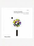
Essential Reading:-



Industrial Parody
FAC1 Early poster for the Russel Club C1978

This poster is one of Peter Saville’s first items of commercial art / design for Factory Records. It promotes one of the first Factory nights at the old Russell Club in Hulme, intended to showcase some of the company’s staple bands. The design is a very obvious visual pun based on the look of BSI work-site hazard warning signs, and it firmly established one of Factory’s multifarious design remits. The conceptualisation of this item alone seems to embody quite a range of ironies, the allusion to industrialism strikes a chord with the ethos of Manchester as the worlds first industrial city. The design concept resonates with that embodied by the word ‘Factory’ though there was a popular belief / assumption that the organisation took its name from Andy Warhol’s famous New York studio.
FAC2 Cover for an early Factory sampler EP c1978

An example of Factory’s principal logo. c1978
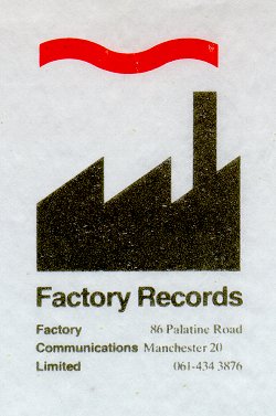
Factory’s principal logo was evidently based on industrial corporate design and seems to evoke the famous ICI logo with its controlled wavy lines. This simple yet memorable graphic became quite an exciting icon for all of us number crunching Factory consumers, and promised innovation and exciting home grown talent, often with high or quirky production values.
FAC145 Christmas Card

FAC18 Industrial fantasy packaging c1980
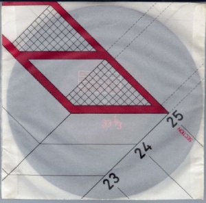
This sleeve design concept for Section 25’s single “Girls Don’t Count” in some ways presaged Saville’s later constructivist inspired work that was to manifest as an ironic celebration of product.
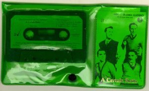
FAC16 Another example of playful thematic packaging for ACR c1980
Deliberate Cool
FAC25 Joy Division’s famous ‘Closer’ album sleeve (c1980) marked an important and influential turning point in Saville’s style.
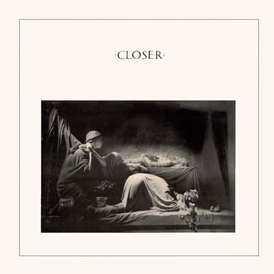
This is one of Saville’s most famous covers, and it was certainly quite a radical stylisation for a rock/pop music sleeve of its time. In fact, this was the first example of a much-copied style that came to be known as “deliberate cool”. The style was characterised by quasi pictorialist photography, distressed textures, understated colour, strong visual delimitation, rigid composition, and classical art values, all of the qualities manifest here. Other designers also copied the framing arrangement. The album has an infamous reputation for its morbidity and contains lyrics that are supposed to disclose Ian Curtis’ suicidal state of mind. The album was probably responsible for starting the mini 80s cult of pre-Madchester miserabalism, the cemetery pop and elegiac urban Gothic of The Smiths et al.
FAC55 ACR – Sextet – album cover c1982

Although Closer is the essential model of deliberate cool, this attractive sleeve concept also meets some of the criterion in so far as it is presented as a strong yet restrained artistic statement. The combined effect of the post-impressionistic painting and copper plate font is one of mature sophistication and it very effectively qualifies the ‘cool’ yet sensual quality of the album itself. The title may allude to a piece by the American minimalist composer Steve Reich whose work is supposed to have inspired some of ACRs minimalist contrapuntal dance music.
FAC75 New Order’s Power Corruption and Lies cover (c1983) represents something of a logical conclusion for the deliberate cool style

Another very famous Peter Saville creation. The industrial / technical lexicon is once again addressed by the colour coding strip (top right) some claim this spells FAC75 in the esoteric alpha / numeric ‘bogbins’ colour coding system familiar to BBC and telecoms technicians or a print calibration reference, it’s almost a visual incongruity. This cover appears in just about every top sleeve design compilation list and often in the top 10. It’s also something of a classic embodiment of Factory’s daring and artistic sense of paradox to package this classic “lads band” in such an evidently whimsical and colourful way.
Constructivism & Product Iconography
FAC50 New Order – Movement – album cover c1981
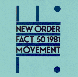
Another approach adopted by Saville alluded to the constructivist design style, and post-constructivist Bauhaus retro. This mode always seemed to be configured into a kind of neo-brutalism that ultimately usurped the idea of ‘branding’ or the indulgence of personality cult marketing by placing all of the emphasis on catalogue numbers.
FAC93 New Order – Confusion – single cover c1983

Here the factory catalogue number (93) has become a prominent feature of the sleeve design and consequent identity of the item.
FAC88 The Wake – Talk About the Past – single cover c1983
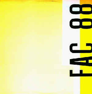
The notion of this kind of meta language of product reaches its logical conclusion in the design of this cover for a single by The Wake. Now the Factory catalogue number has become the only mark of identity almost as a cipher effectively forcing the collector/end user to engage with Factory’s (at this time) obsessive interest in numerical identity and the quasi-industrial brutalism it implied. The design of this sleeve is also interestingly suggestive of Soviet style machine markings.
Anti Product
FAC10 Joy Division – Unknown Pleasures – album cover c1979
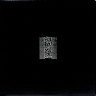
One of Factory’s earliest album releases and also one of the most iconic Factory and Joy Division albums ever. ‘Unknown Pleasures’ was years ahead of its time in many respects but the concepts embodied in the design of the cover alluded to a notion of anti-product and anti-commercialism. The album was packaged with no descriptive information of any kind and understated to the point of ego-phobic anonymity, something elusive quietly skulking in the shadows. The irony was that this enhanced the elite feel of ownership and sense of being ‘in the know’ with JD fans. I always found this deliberate obscurantism to be synonymous with exciting and even dangerous progressive ‘underground’ ideas. The discovery of ‘Pleasures’ was an epiphany for many and the beginning of a fascination for everything Factory did.
FAC14 Durutti Column – Return of The Durutti Column – album cover c1979

This harsh intentionally auto-destructive sandpaper cover belies the whimsical beauty of Vini Reilly’s first album release with Factory. Return of the Durutti column was the first nod to the situationist ideals that Factory was intended to embody, according to Tony Wilson. The sleeve was almost completely devoid of markings and made of rough sandpaper; inside and out. It was formulated as another anti-product gesture intended to damage both itself and other adjacent covers – a metaphor for anarchic post-punk nihilism that is again strewn with more than a hint of playful irony.
The Prelude to Madchester
FAC59 52nd Street – Look into My Eyes – 12in Single c1982
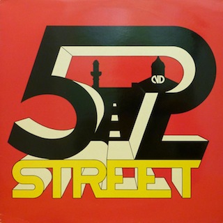
From the early 80s Factory began to sign a wide variety of home-grown R&B and Jazz/funk based artists. This very rare single release by 52nd street was Factory’s contribution to the burgeoning Brit Funk scene and found its way on to many Hacienda play lists in the late 80s. The sleeve design may not be one of Saville’s creations but it is still unmistakably ‘Factory’. 52nd Street were probably the most ‘main stream’ Jazz/Funk act in the Factory stable but many others such as ACR, ESG, Quando Quango and Kalima were bending the genre in interesting new ways with unconventional production and rhythm structures.
FAC102 Quando Quango – Atom Rock – 12in single c1982

FAC220 Happy Mondays – Bummed – album cover c1988
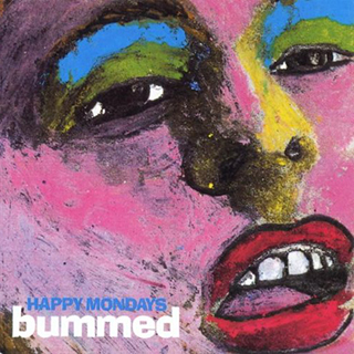
To many the Mondays along with the Stone Roses were the quintessential ‘Madchester’ bands mixing rock elements with hip hop, Northern Soul vibes and a dose of early Boomer / X’er generation nostalgia for the 60s early 70s. By the late 80s when the ‘madchester’ scene was in full swing and Factory had become a leading proponent of the new ‘house’ music culture in the UK; much of the design by this time was provided by out-sourced agencies or a large group of in-house designers at Factory HQ. This famous cover however, was the work of Central Station Design in Manchester.
The Haçienda Years
From 1982 Factory seemed to become much more skittish and light hearted in terms of design and marketing. The industrial motif itself began to appear in a range of increasingly self parodied forms with an emphasis on frivolity and playful colour, ultimately alluding to a sort of clash between constructivist styling and psychedelic aspiration. The industrial feel of Factory’s (Peter Savill’s) design vision was non the less still very much in tact and an obvious foundation of much of the design. This was also the period when Factory’s famous industrial design ethos was assimilated into the UK packaging of the new House music phenomena through the cult of the Hacienda, and in one way manifest as the re-appropriation of industrial clothing as fashion. The House music ‘scene’ in the US (Chicago) was more associated with sports styling.
FAC51 The Hacienda interior
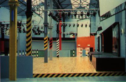
The Hacienda interior was loosely based on a trendy New York disco and designed by Ben Kelly who was commissioned by Factory in the early to mid 80s to design the companies corporate and recreational spaces including the Dry Bar, The Area, and Factory’s new HQ on Princess Street, later The Paradise Factory club. Kelly’s approach was obviously sympathetic to the industrial design concept followed by Saville and in many ways also seems to evoke the feel of constructivism. Though the Haçienda is probably not one of Kelly’s most notable examples (the Dry Bar & Paradise were more striking in my opinion) it does non the less incorporate very evident references to the De Stijl aesthetic possibly even the famous Schröder House style. Though Kelly also seems to assimilate these classic indexes of modernism into the form of almost whimsical industrial parodies conflated with stark 80s minimalism and the BSI industrial colour pallet
Hacienda House wine label c1983
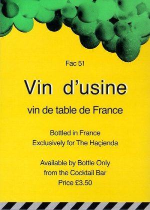
This is a bit of a curiosity. The design of this label also appears to make a passing reference to the fashionable David Lynch style dystopian kitsch and complimented the retro industrial canteen feel of the Hacienda’s early bar spaces.
FAC83 Hacienda 1 year celebration

This was the first piece of promo art work by Saville to use Kelly’s hazard stripe motifs as iconic decoration, which by now had become synonymous with the Haçienda and emblazoned all of its items of publicity and merchandise, see the wine label above.
Haçienda 5 years celebration
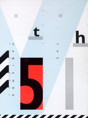
The constructivist mode of design is so strongly evoked here that this poster could almost be a cover for a constructivist manifesto designed by El Lissitzky circa 1924.
FAC518 Haçienda 8 years celebration
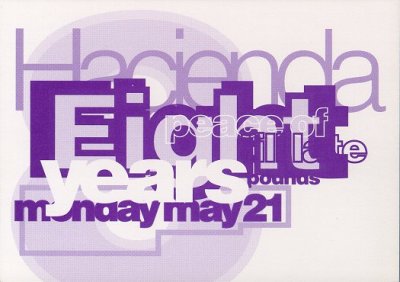
Something of a break with tradition seems to be evident here. This poster was designed at a time when the Haçienda cult was beginning to run out of steam and when the attendant Madchester phenomenon was also post peak. It’s very difficult to categorise this “end of typography” information theory obsessed style with the classic Factory remit as defined above and it seems like a desperate attempt at attention grabbing funky commercialism.
© 2004 Oliver Wood – updated 2018